15 Sophisticated Pink Bedroom Decor Ideas That Look Grown-Up
A pink bedroom reads adult when four things are in place, and every layout below follows them. Get these right and the color stays calm, easy to live with, and miles away from a nursery.
- Start with a muted, dusty undertone. Plaster rose, terracotta blush, or soft mauve all beat sugary bubblegum.
- Ground the pink with warm neutrals. Oatmeal linen, walnut timber, or matte black iron do the heavy lifting.
- Choose hard-wearing, textured fabrics. Washed Belgian linen, waffle cotton, and slub canvas resist lint and wash easily.
- Layer 2700K ambient and task lighting. Walls pick up a warm golden-hour glow instead of an icy neon reflection.
I have tested these combinations in compact rentals and full remodels across American homes, so each idea comes with the catch the photos leave out, plus a cheaper way in.
Architectural and Focal Wall Treatments
Start with the walls, because they set the undertone for everything else. Tape up large swatches and look at them in the morning, at dusk, and under your actual bedside bulbs before you commit to a gallon.
1. Muted Plaster Rose Vertical Shiplap Accent Wall
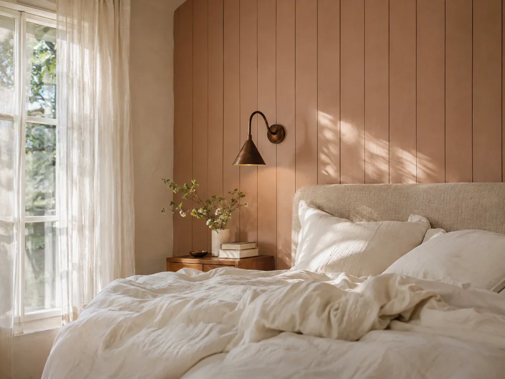
Vertical boards are a smart trick for a standard 8-foot ceiling. Your eye follows the lines upward, so the room feels taller without a single structural change. Run the boards behind the bed and let them do the work a busy headboard would otherwise do.
Undertone & Palette: Sherwin-Williams Rose Tan is a warm, rosy beige with enough tan in it to skip the sweetness completely. It sits mid-tone, so pair it with a soft cream on the remaining three walls and let walnut or iron bring the contrast.
Tactile Texture Pairing: Matte painted shiplap against a slubby oatmeal linen headboard keeps the wall from reading as one flat block. Add one matte bronze sconce and the board shadows suddenly look intentional.
Real-Life Living Reality: Those pretty grooves are dust shelves, even when they run vertically. Expect to go over them with a microfiber wand every couple of weeks, and know that any scuff near the bed frame shows up fast on a matte finish.
Budget or Renter-Friendly Swap: Peel-and-stick shiplap panels cost far less and come down at move-out. Test one panel first, since some adhesives lift paint on freshly coated or textured drywall.
Moody Terracotta-Pink Color-Drenching Across Drywall and Baseboards
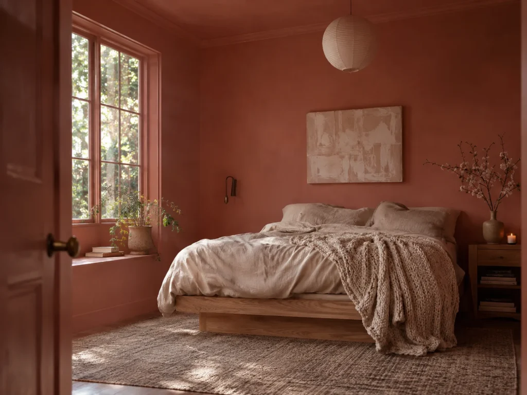
Color drenching means walls, baseboards, door, and trim all wear the same shade. It sounds risky, and yet it often makes a small bedroom feel more settled, because no bright white trim is chopping the room into pieces.
Undertone & Palette: Go for a clay-leaning pink with a brown base. Farrow & Ball Sulking Room Pink sits at the dustier end of this family, and it stays grown-up because the earthiness cancels any sugar. Keep the bedding in oatmeal and ivory so the room can breathe.
Tactile Texture Pairing: Chalky matte walls next to raw oak and a nubby wool throw give the eye somewhere to land. Use satin on the baseboards so the same color catches light differently at floor level.
Real-Life Living Reality: Direct afternoon sun can push a terracotta pink toward something much hotter than your swatch. A north-facing room does the opposite and may turn it muddy, so watch a sample for two full days before buying paint.
Budget or Renter-Friendly Swap: Skip the trim and drench only the wall behind the bed, then match your curtains to it. If you are still undecided about pink, these moody tonal schemes that avoid going flat use the same layered logic in deeper shades.
Vintage Botanical Peel-and-Stick Mural with Dusty Mauve Tones

A faded botanical gives you pattern without a single cute motif. Look for loose, painterly stems instead of crisp florals, and keep the scale large. Tiny repeating flowers are where this idea tips into little-girl territory.
Undertone & Palette: Choose a mural with dusty mauve, faded sage, and parchment, then paint the other walls Farrow & Ball Calamine or a similar powdery pink. Muted greens are what make this one feel like an old botanical print instead of a party backdrop.
Tactile Texture Pairing: Smooth printed vinyl needs something rough beside it. A slub canvas bench cushion and an unlacquered brass picture ledge break up the slick surface nicely.
Real-Life Living Reality: Peel-and-stick hates humidity and heavily textured drywall. Corners may lift near an en suite bathroom, and orange-peel texture can show right through, so run a test strip first.
Budget or Renter-Friendly Swap: Buy two or three panels and frame them as oversized art instead of covering the wall. Thrifted poster frames sprayed in a warm metallic finish get you most of the effect for much less.
Two-Tone Half-Wall with Warm Blush Base and Creamy White Upper Drywall

This is the most forgiving layout on the list, especially for a teen heading into high school. The color sits low, the upper wall stays bright, and you can change your mind about the top half with one can of paint.
Undertone & Palette: Use Rose Tan or a deeper blush below and a creamy white above, avoiding any crisp blue-white. On an 8-foot ceiling, keep the line around 36 to 40 inches, and on a 9-foot ceiling you can raise it a few inches.
Tactile Texture Pairing: Eggshell paint on the lower half pairs well with a matte upper wall, and a thin oak picture rail makes the break look finished. Waffle cotton on the bed adds the soft contrast.
Real-Life Living Reality: A wobbly paint line will bother you every day forever. Use a laser level, seal your tape with a little of the base color, and pull it while the top coat is still slightly wet.
Budget or Renter-Friendly Swap: Removable wallpaper in a solid plaster color works for the lower section. Finish the top edge with a lightweight strip of trim attached by removable mounting tape.
Bedding and Soft Linen Layers
Bedding is the easiest place to bring in pink and the easiest to replace later. Buy for how it will look after thirty washes, not how it looks folded in the store.
Washed Blush-Rose French Linen Duvet Paired with Olive Green Accents

Rumpled linen automatically takes the preciousness out of pink. Add olive and the whole bed shifts from sweet to collected, a lot like a good linen shirt with army-green trousers.
Undertone & Palette: A blush-rose with a gray cast sits beautifully against Benjamin Moore First Light on the walls, a very soft, pale pink. Olive throw pillows provide the near-opposite hue that keeps the pink from taking over.
Tactile Texture Pairing: Stonewashed linen against a smooth, cool-toned ceramic lamp base feels relaxed and considered. Add an olive velvet lumbar on a Queen, or one square pillow on a Twin XL.
Real-Life Living Reality: Benzoyl peroxide acne cream will bleach pale spots right into a pink pillowcase. Keep a white or dark set for skincare nights, and expect self-tanner and foundation to leave marks too.
Budget or Renter-Friendly Swap: Linen-cotton blends from Target or IKEA give you much of the look at a friendlier price. You can also buy a single linen duvet cover and pair it with sheets you already own.
Channel-Tufted Velvet Headboard in Antique Mauve
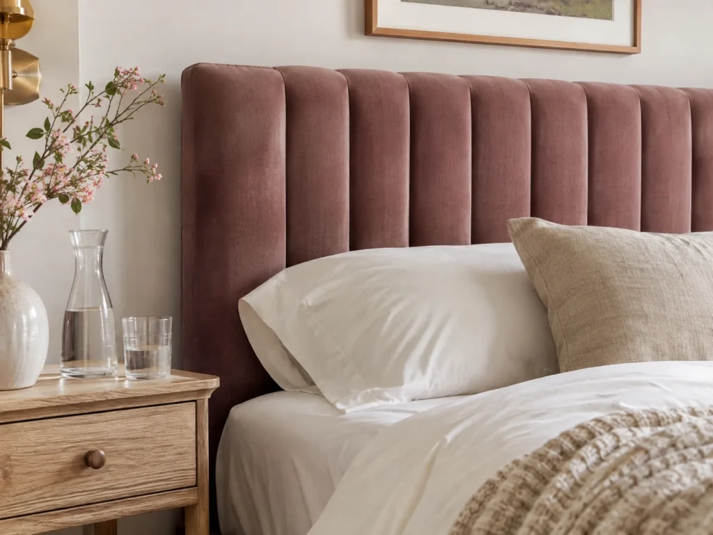
Vertical channels look tailored, while button tufting tends to read more glam or dorm room. Size matters here. On a Queen, go a few inches wider than the 60-inch mattress on each side so the headboard doesn’t look like an afterthought.
Undertone & Palette: Antique mauve has a gray-brown base, so it can sit against warm white or Farrow & Ball Peignoir without clashing. Keep the sheets in ivory and let the headboard be the only saturated piece.
Tactile Texture Pairing: Ribbed velvet next to raw oak nightstands gives you plush against dry and grainy. A linen pillow in front stops the upholstery from feeling too formal.
Real-Life Living Reality: Velvet collects pet hair like it is being paid to. Hair oil and dry shampoo also leave a darker patch right where your head rests, so a lint roller and a removable cover are worth having.
Budget or Renter-Friendly Swap: Wrap foam-covered plywood strips in thrifted velvet and mount them with heavy-duty French cleats. If you cannot drill, stand the panel on the floor behind the bed and let the frame pin it in place.
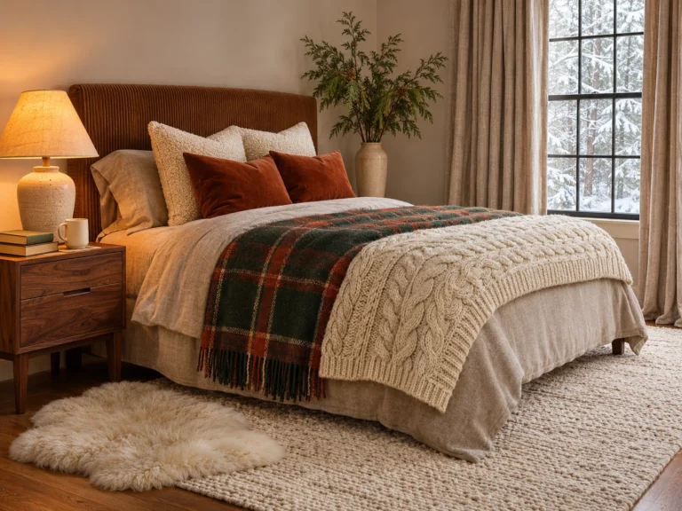
Chunky Oatmeal Knit Blanket Layered Over a Blush Waffle Quilt
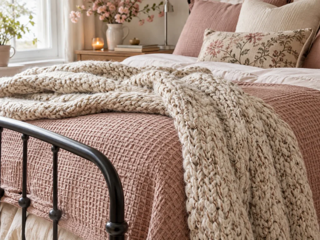
Here the pink plays the supporting role. Oatmeal takes over the top third of the bed, and the waffle quilt peeks out in a soft strip that feels incidental.
Undertone & Palette: A beige-rose quilt and a flecked oatmeal knit are close enough in value to look quiet together. Avoid a bright white blanket, since it makes even muted blush look pinker.
Tactile Texture Pairing: Grid-textured waffle cotton against a loose, chunky knit gives you two very different softnesses. A matte black iron bed frame keeps the pile from looking too sweet.
Real-Life Living Reality: Chunky knits snag on rings, pet claws, and the corner of a laptop. Many are also dry-clean-only or a huge pain to wash at home, so check the care tag before you fall in love.
Budget or Renter-Friendly Swap: A machine-washable cotton throw in a medium waffle or basket weave gets you close. Keep it folded at the foot of a Full or Twin XL, where a huge blanket would swamp the mattress.
Low-Pile Faded Vintage Turkish Runner with Muted Berry and Cream Undertones
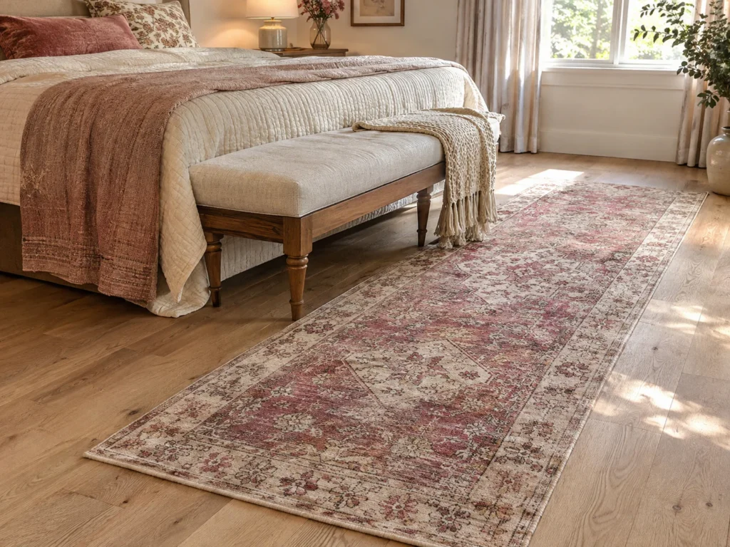
A worn runner fixes the problem many pink rooms have, which is that everything feels new at once. One piece with visible age makes the whole room look less staged.
Undertone & Palette: Muted berry and cream carry more weight than pale pink, so the rug anchors the floor. Pull that berry into one pillow, then leave it alone.
Tactile Texture Pairing: Flat, slightly worn wool against a smooth oak floor or low-pile carpet feels layered. Pair it with a slub canvas bench at the foot of the bed for one more dry, matte surface.
Real-Life Living Reality: Real vintage rugs shed, fringe gets eaten by vacuums, and an old rug without a pad will slide right out from under you. Budget for a non-slip pad, and shake it outside instead of using a beater bar.
Budget or Renter-Friendly Swap: Washable printed runners in faded patterns have gotten surprisingly good, and they are ideal for a dorm or first apartment. Check Facebook Marketplace or estate sales for real wool at a fair price.
Functional Vanity, Study and Cozy Corners
This is where a bedroom proves whether it can handle daily life. Skincare, chargers, and a planner all need a place that is not the top of the bed.
Floating Birch Vanity Desk with an Arched Brushed Brass Mirror
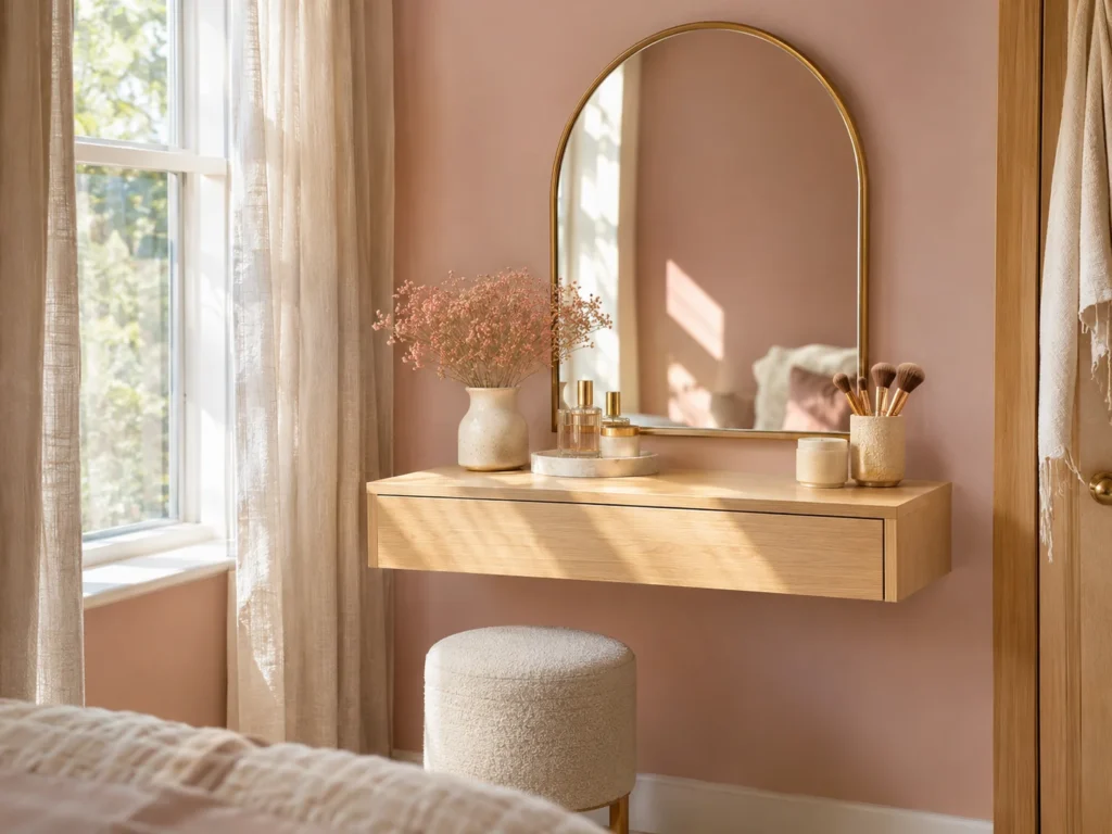
A wall-mounted surface opens up the floor, which matters a lot in a 10-by-10 room. It is one of my favorite space-maximizing layouts for small bedrooms because the same surface can handle mascara at 7 a.m. and homework at 7 p.m.
Undertone & Palette: Pale birch has a clean, slightly yellow warmth that keeps blush from looking chilly. Keep the wall behind it a soft pink and let the brushed brass mirror provide the only shine.
Tactile Texture Pairing: Matte birch grain beside brushed brass feels crisp without looking like a hotel. A slub linen stool cushion softens the corner.
Real-Life Living Reality: Makeup fallout lands everywhere, and powder settles into exposed wood grain. Seal the top with a water-based matte poly and keep a small tray under anything that spills.
Budget or Renter-Friendly Swap: Mount a birch-look IKEA tabletop on brackets, or set it on two slim drawer units if you cannot drill into studs. Thrifted arched mirrors take brass spray paint very well.
Built-In Blush Reading Alcove Framed by Floating Natural Oak Shelves

Any closet nook or dead corner can become this. Paint the inside a shade deeper than the room, and it instantly feels like its own small space.
Undertone & Palette: Sherwin-Williams Malted Milk is a warm, light beige with a soft rosy feel that works beautifully in a low-light nook. Natural oak shelves keep it from drifting toward peach.
Tactile Texture Pairing: Oak grain against a washed linen seat pad gives you the warmth and the slouch. Add one matte ceramic vase so the shelf has a cool, smooth note.
Real-Life Living Reality: Open shelves show every messy phase of your life. Books also get heavy fast, so anchor brackets into studs and keep the styling to about two-thirds full.
Budget or Renter-Friendly Swap: Flank a chair with two IKEA BILLY bookcases, add a simple oak-look board across the top, and you have faked a built-in. Paint the wall between them and take the whole thing with you when you move.
Matte Brass Grid Wall Organizer for Prints, Jewelry, and Daily Planners
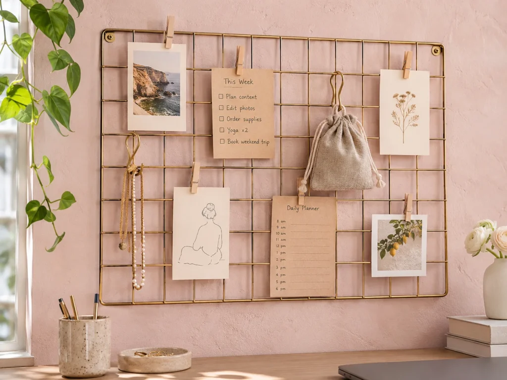
A grid gives all your small stuff one boundary, which is the real reason it looks tidy. Hang it above a desk at eye level and limit yourself to what you actually use this month.
Undertone & Palette: Matte brass reads warm against soft rose and avoids the school-locker effect of white or chrome wire. Stick to cream paper, kraft tags, and one or two dark prints.
Tactile Texture Pairing: Fine metal lines look great against a chalky matte wall. Clip a slub linen pouch to the grid for jewelry and you will have a soft-versus-hard contrast at close range.
Real-Life Living Reality: Grids turn into clutter magnets faster than you would expect. Delicate chains also tangle on each other, so give necklaces separate hooks and edit the whole board every month.
Budget or Renter-Friendly Swap: Spray a basic wire grid from Target or the dollar aisle with matte brass paint. Removable adhesive hooks will hold a light grid, and a few binder clips cover the rest.
Wardrobe, Furniture and Everyday Storage
Wood tones and hardware are where pink either grows up or does not. A couple of heavier pieces can steady the softest room.
Mid-Century Walnut Nightstands Paired with Blush Ceramic Bedside Lamps
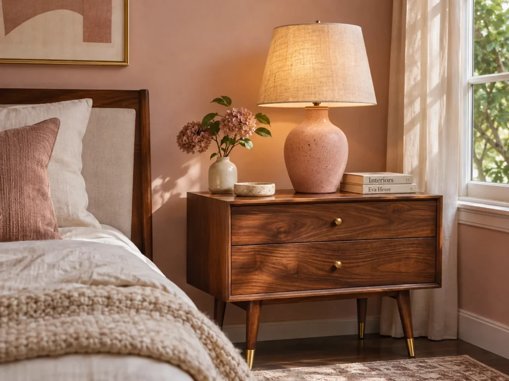
Walnut is the fastest way to take the sugar out of a pink room. There are plenty of ways to style a bedroom around dark wood, and a soft dusty wall happens to be one of the most flattering backdrops for it.
Undertone & Palette: Reddish-brown walnut and dusty blush share a warm base, so they look related instead of matched. Keep the lampshades off-white so the ceramic carries the color.
Tactile Texture Pairing: Oiled walnut against a glazed or matte-speckled ceramic base is a lovely small-scale contrast. A woven linen shade filters the bulb and adds a third texture.
Real-Life Living Reality: Water glasses leave rings on oiled wood, and old veneer chips at the corners. Use a coaster, and measure before buying, since a nightstand should sit roughly level with the top of your mattress.
Budget or Renter-Friendly Swap: Thrift mid-century pieces or look for West Elm dupes at Target and on Facebook Marketplace. Two mismatched nightstands in the same wood family often look better than a set.
Refurbished Thrifted Tallboy Dresser in Dusty Rose with Ribbed Bronze Pulls
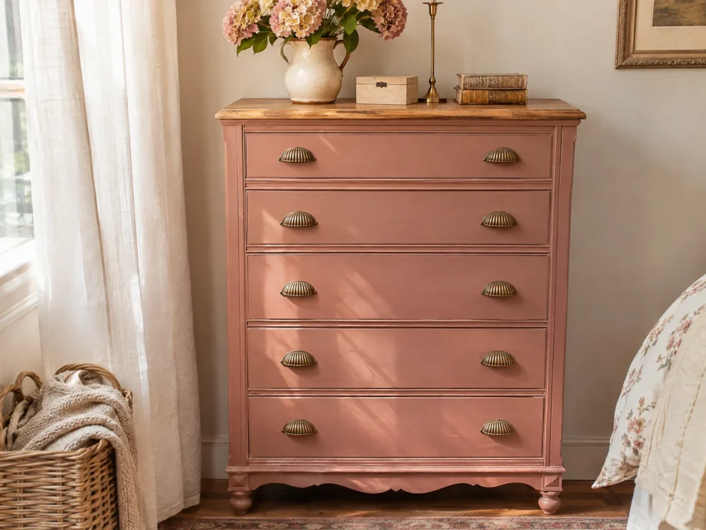
A tall dresser gives you drawer space on a small footprint, and it pulls the eye up in a room with low ceilings. In a tight floor plan, it pairs well with small closet solutions that double your storage, so off-season clothes are not fighting for the same drawers.
Undertone & Palette: A dusty rose with a touch of brown works best on furniture, since large painted surfaces always look stronger than the chip. If your walls are pink too, go lighter or darker by at least two steps.
Tactile Texture Pairing: Smooth matte enamel looks expensive next to ribbed bronze pulls. Leave the top in natural wood if the grain is good, and you get a built-in contrast.
Real-Life Living Reality: If that dresser was made before 1978, test any old paint for lead before you sand it. Also anchor it to a wall stud, because tall thrifted dressers tip more easily than you would think, especially with drawers pulled out.
Budget or Renter-Friendly Swap: Keep the wood and change only the pulls, which you can reverse when you leave. Removable contact paper on the drawer fronts is another low-commitment way to test the color.
Woven Natural Rattan Baskets with Canvas Liners to Conceal Vanity Cables
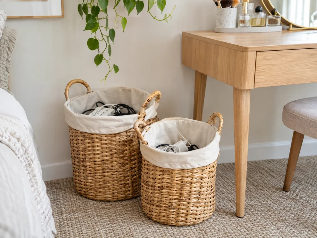
Dryers, straighteners, ring lights, and chargers are the real enemy of a grown-up vanity. Baskets give all those cords a home and bring in the natural fiber this palette needs.
Undertone & Palette: Honey-toned rattan warms up a cool pink and bridges the gap between blush walls and oak furniture. Choose an undyed cream or oatmeal canvas liner so the basket stays neutral.
Tactile Texture Pairing: Rough woven rattan against smooth canvas is the whole appeal here. Set the basket beside a brass tray for a bit of polish.
Real-Life Living Reality: Never drop a hot curling iron or straightener into a fabric-lined basket, and do not bury a charging power strip under textiles. Let tools cool on a heat-safe mat first, and keep the strip somewhere with airflow.
Budget or Renter-Friendly Swap: Thrifted baskets plus a canvas liner you hem yourself will cost very little. For the cords, adhesive clips and a simple cable box under the desk handle most of it.
Lighting and Finishing Touches
Light is the last layer and also the one that decides what color your walls really are. Save some budget for it.
Fluted Amber-Glass Bedside Pendants Fitted with 2700K Warm Edison Bulbs
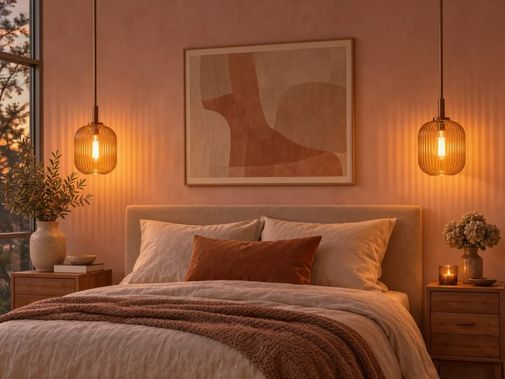
Amber glass pulls pink toward honey and rose after dark. Hung on either side of the bed, pendants also clear the nightstand for books, water, and your phone, and they feel far more thoughtful than one lonely ceiling fixture.
Undertone & Palette: Warm amber flatters every dusty pink on this list, while a 2700K bulb keeps the walls in that golden range. Cool 4000K or 5000K bulbs are the fastest way to make muted rose look harsh and synthetic.
Tactile Texture Pairing: Ribbed glass against a matte plaster-pink wall looks rich at night and sculptural during the day. Brushed bronze hardware keeps the whole fixture on the warm side.
Real-Life Living Reality: Amber glass eats a surprising amount of light, so it will not be enough to read by on its own. Fluting also gathers dust in every groove, and on an 8-foot ceiling you will want the shade around seated eye level so nobody hits their head getting out of bed.
Budget or Renter-Friendly Swap: Plug-in pendants on swag hooks skip the electrician completely. For more options, these lighting setups without overhead glare work well in rentals, and a dimmable 2700K LED fits nearly all of them.
Four Grown-Up Pink Styles Compared
Use this as a quick way to settle on a direction before you buy anything.
| Style | Core Color Anchor | Signature Materials & Textures | Practical Storage Solution | The Juvenile Trap to Avoid |
|---|---|---|---|---|
| Dusty Mauve Minimalist | Gray-based mauve with warm white and matte black | Washed linen, matte plaster-look paint, slim iron frames | Closed flat-front dresser and under-bed drawers | Glittery accents or a wall of tiny framed quotes |
| Warm Terracotta Boho | Clay pink with oatmeal and walnut | Slub canvas, rattan, flat-woven wool, raw oak | Lidded rattan baskets and a simple wall rail with pegs | Rainbow tassels and too many mini macrame hangings |
| Parisian Chic Blush | Soft blush with cream and aged brass | Antique mirrors, velvet accents, painted wall trim | Slender tallboy and a thrifted armoire | Oversized bows, ruffled shams, and pink chandeliers |
| Soft Scandi Pastel | Pale pink with birch and soft white | Waffle cotton, pale wood, matte ceramics | Floating shelves with labeled canvas bins | Cartoon prints, pastel rainbows, and baby-bright contrast colors |
Common Styling Mistakes to Avoid
Picking high-gloss bubblegum paint. Gloss bounces light right back at you and exaggerates every patch and roller mark. Add a clean, bright pink on top of that, and even the nicest furniture will look like it belongs in a playroom.
Ignoring your natural light exposure. North-facing rooms pull colors cooler and grayer, while west-facing rooms can get very hot by late afternoon. The same logic applies if you are keeping a grey bedroom warm rather than cold, so test every shade on the wall you will actually see from bed.
Skipping textural contrast. Smooth pink paint with smooth pink bedding and a smooth pink rug turns into a single flat surface. Mix in at least one rough fiber, one wood, and one metal.
Overcrowding open dressers with trinkets. Lots of tiny objects are what make a room feel young, even when each one is nice. Group what you love on one tray, and move the rest of it into a drawer.
Quick FAQ
How do you make a pink bedroom look adult and sophisticated?
Choose a muted pink with brown or gray in it, then balance it with wood, cream, and one dark element like iron or walnut. Skip themed decor and small novelty accents. Warm 2700K lighting finishes the job.
What colors balance out pink in a bedroom?
Oatmeal, cream, olive, walnut brown, and charcoal all work well. Olive provides gentle contrast, and brown or black keeps pink from feeling too sweet. Limit yourself to one or two supporting colors.
Which paint sheen works best for pink bedroom walls?
Matte or eggshell is usually the best choice for walls, since both hide flaws and keep the color soft. Use satin on baseboards and trim, where you will need to wipe off scuffs. Avoid gloss on large wall areas.
How do you prevent light pink bedding from looking washed out or dingy?
Wash pink bedding apart from heavily soiled items, use a modest amount of detergent, and skip chlorine bleach. Oxygen-based brighteners are gentler for light colors, as long as the care label allows them. Rotate two sets so one is not taking all the wear, and keep the bed out of harsh direct sun when you can.
Grounded Closing Thoughts
The pink rooms that hold up over time have a neutral backbone. Put your money into the pieces that are hard to change, like a good wood dresser, a solid bed frame, and paint you have actually tested on your own wall.
Then let the personality live in things you can swap on a Saturday, like pillows, lamps, art, and a throw. Your taste at 17 will not match your taste at 27, and a room built this way can change right along with you.