Black and Grey Bedroom Ideas That Feel Cozy, Moody and Never Flat
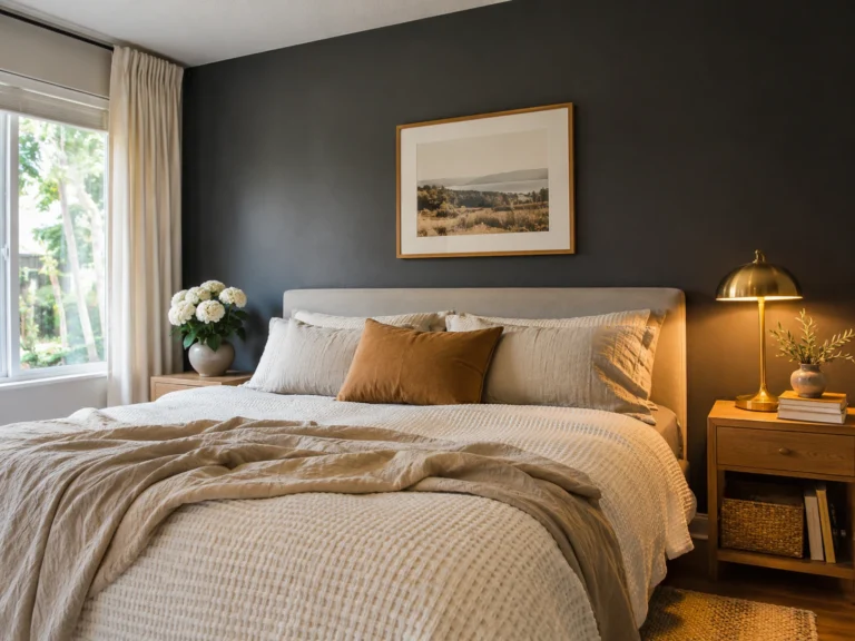
Dark rooms go flat when every surface sits at the same depth. Charcoal walls, charcoal bedding, charcoal curtains, and the whole thing reads as one grey blur instead of a moody retreat. Build a tonal ladder instead.
Run four distinct steps, deep charcoal down to slate, then heather grey, then warm dove, so your eye has somewhere to travel. Pair at least two contrasting textures on every surface, because texture is what separates depth from murk.
Add warm wood, walnut or white oak, to break the chill before it sets in. Then light it at 2700K and never brighter. That ladder plus texture is the entire difference between a cave and a room you want to sleep in.
Architectural and Wall Treatments
Matte Black Board-and-Batten Behind the Headboard
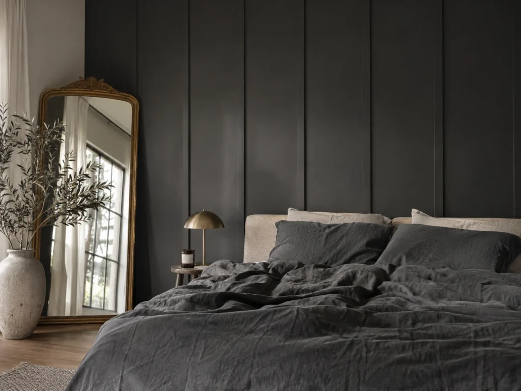
Battens turn a flat dark wall into something with real relief. Painted in a deep matte charcoal with a faint brown base, Sherwin-Williams Iron Ore being the usual pick, the vertical strips cast their own narrow shadows all day long. That shadow play is the depth a plain painted wall never gets.
Pair the matte paint against something smooth and reflective to kill the flatness. A washed linen duvet in front of it works, so does a single sheet of antique mirror leaning in the corner. Rough wood plus one slick surface is the formula.
Matte black drywall is unforgiving in daily life. Every scuff from a vacuum, a belt buckle or a headboard corner shows as a grey streak, and touch-up paint never blends into matte invisibly. Go eggshell on the battens and keep a labeled jar of the exact color on the closet shelf.
Renters can get this with peel-and-stick charcoal slat panels, which run a fraction of the cost of lumber and trim. They come off with a heat gun and leave the drywall intact.
Bedroom Blueprint
Room Size: Works at 8 foot ceilings. Keep battens to the headboard wall under 130 square feet.
Placement Map: Battens spaced 16 inches on center, running floor to ceiling behind a Queen or King.
Budget Tier: Mid.
Calm Score: 8 out of 10.
Soft Dove Grey Limewash Wrapping All Four Walls
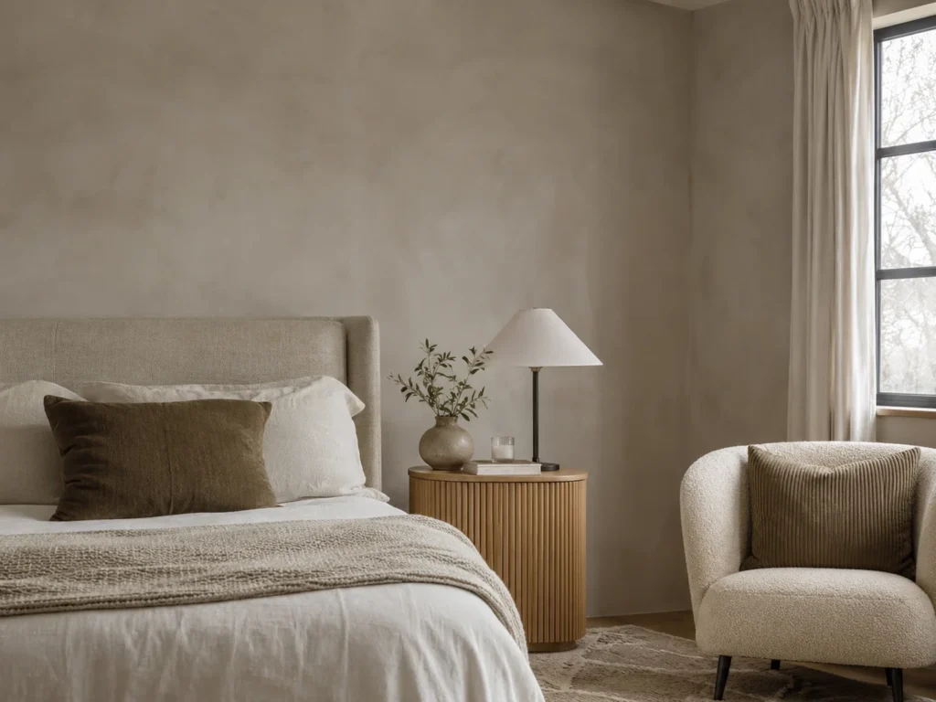
Committing dove grey to every wall is a different animal from a single accent. The undertone has to be warm, close to Sherwin-Williams Repose Gray, because a cool dove with any blue in it turns the whole room lilac rather than restful. Limewash adds cloudy movement so the four walls never read as a box.
Contrast the chalky wall against something tight and ribbed. A fluted wood nightstand or a corduroy cushion against limewash gives you soft versus structured in the same glance. Two textures, one color family.
North-facing windows are the real test. Cool northern light pulls blue-based greys toward purple between about 8am and noon, and it is the single most common complaint with dove grey. Sample a large square on white card and check it at three different hours before you buy gallons.
Cheaper route: a warm dove matte emulsion with a dry-brushed second coat in a lighter tone, applied in loose circles. Limewash costs considerably more per gallon for a similar effect at arm’s length. If your palette is leaning cooler overall, this breakdown of keeping a grey bedroom warm rather than cold covers undertone selection in more detail.
Charcoal Color Drenching Across the Ceiling
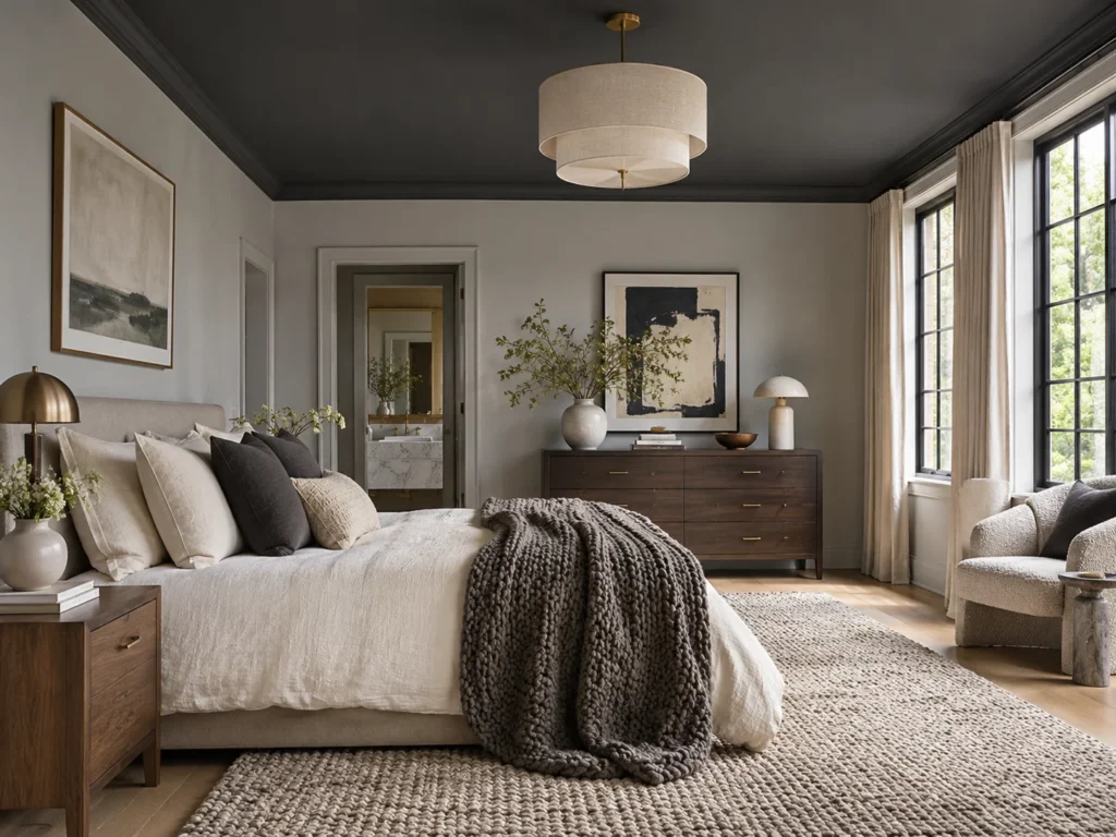
Taking charcoal up onto the ceiling while keeping the perimeter walls a soft grey is the move almost nobody tries, and it is the one that makes a bedroom feel genuinely enveloping. Benjamin Moore Kendall Charcoal overhead with a heather grey on the walls gives you two clear rungs of the ladder without any black at all.
The texture pairing matters more here than anywhere. A smooth painted ceiling over a nubby wool rug and a chunky knit throw keeps the room from feeling like a sealed container. Hard and flat above, soft and deep below.
A dark ceiling eats light, and at 8 foot drywall height it will feel lower than it measures. This idea genuinely needs 9 foot ceilings, or at minimum three warm lamp sources to compensate. Skip it in a north-facing room with one window.
Renter alternative: a large charcoal fabric canopy or a wide swathe of dark fabric tacked across the ceiling above the bed gives a similar enclosed feeling with no paint at all.
The Four-Rung Tonal Ladder
Rung one, deep matte charcoal: one architectural surface only, a wall or the ceiling.
Rung two, slate or pewter: the largest textile, usually the duvet.
Rung three, heather grey: throws, pillows, upholstery.
Rung four, warm dove or greige: walls, lampshades, curtains.
Skip a rung and the room flattens. Hit all four and it reads as depth rather than darkness.
Bedding and Soft Textiles
Washed Charcoal Linen Under a Heather Grey Waffle Blanket

This pairing is the tonal ladder working inside three feet of bed. Charcoal linen sits at rung two with its slubby uneven weave, and a heather grey waffle blanket at rung three brings flecks of warmer fiber running through it. Neither is black, which is exactly why the bed stays soft rather than severe.
The textures work against each other on purpose. Linen is loose and rumpled, waffle is a tight raised grid. Lay the grid over the rumple across the bottom third of a Queen and the bed gains dimension without a single extra color.
If you have a shedding pet, dark bedding is a daily commitment. Light fur shows on charcoal cotton within hours. Linen hides it noticeably better than cotton because the irregular weave breaks up the contrast, but keep a lint roller in the nightstand drawer regardless.
A cotton-linen blend duvet costs a fraction of pure linen and rumples nearly as well after two warm washes. Target and HomeGoods both carry heather waffle blankets at a fraction of boutique pricing.
A Charcoal Velvet Channel-Tufted Headboard
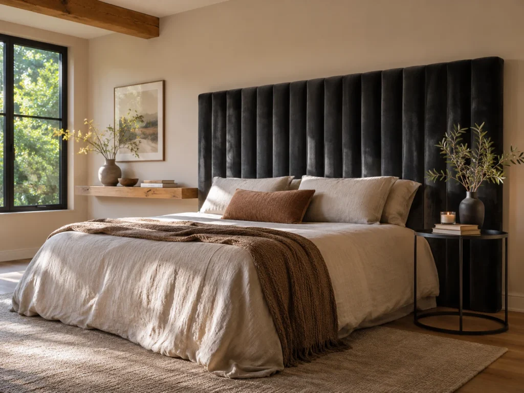
Channel tufting runs in long vertical columns rather than the diamond grid of button tufting, and that vertical line is what keeps a dark headboard from reading as one heavy slab. In charcoal velvet, the pile catches light along every channel ridge and throws back a faint amber sheen at the edges.
Set the velvet against something matte and hard. Matte black iron nightstands either side, or a raw timber ledge above, gives you plush against rough. Velvet alone in a dark room goes muddy, so it needs that opposition.
Velvet holds dust in every channel groove and pet hair clings to the pile badly. A soft brush attachment every couple of weeks keeps it looking right, and crushed velvet hides wear far better than a smooth pile if the bed sees heavy use.
A velvet headboard slipcover over a frame you already own costs a fraction of a new bed. Alternatively, upholster a plywood panel yourself and hang it on a French cleat.
Bedroom Blueprint
Room Size: Medium to large. A tall tufted headboard crowds a room under 120 square feet.
Placement Map: Centered on the longest wall, top edge around 48 inches from the floor.
Budget Tier: Mid to high.
Calm Score: 9 out of 10.
A Monochrome Ombre Pillow Arrangement

Stacking pillows from darkest at the back to palest at the front builds the tonal ladder in miniature. Charcoal shams behind, slate euros in the middle, then a soft dove lumbar in front. Four rungs across eighteen inches of bed, and it is the fastest way to prove the room is tonal rather than just dark.
Vary the weave at every step or the gradient reads as flat paint samples. Smooth percale shams at the back, a ribbed knit euro in the middle, a boucle lumbar in front. Each rung gets its own surface.
Honest note on upkeep: Light grey pillow fronts pick up hair oil and makeup faster than anything else on the bed, and dove grey shows it clearly. Pick removable covers you can wash separately, not sewn-shut decorative pillows.
Pillow covers rather than whole cushions is the cheap route, and it lets you shift the gradient by season without storing bulk. Thrifted inserts work fine underneath. There is more on building this kind of layered bed in these master bedroom setups built for two people.
A Light Grey Bouclé Bench at the Foot of the Bed
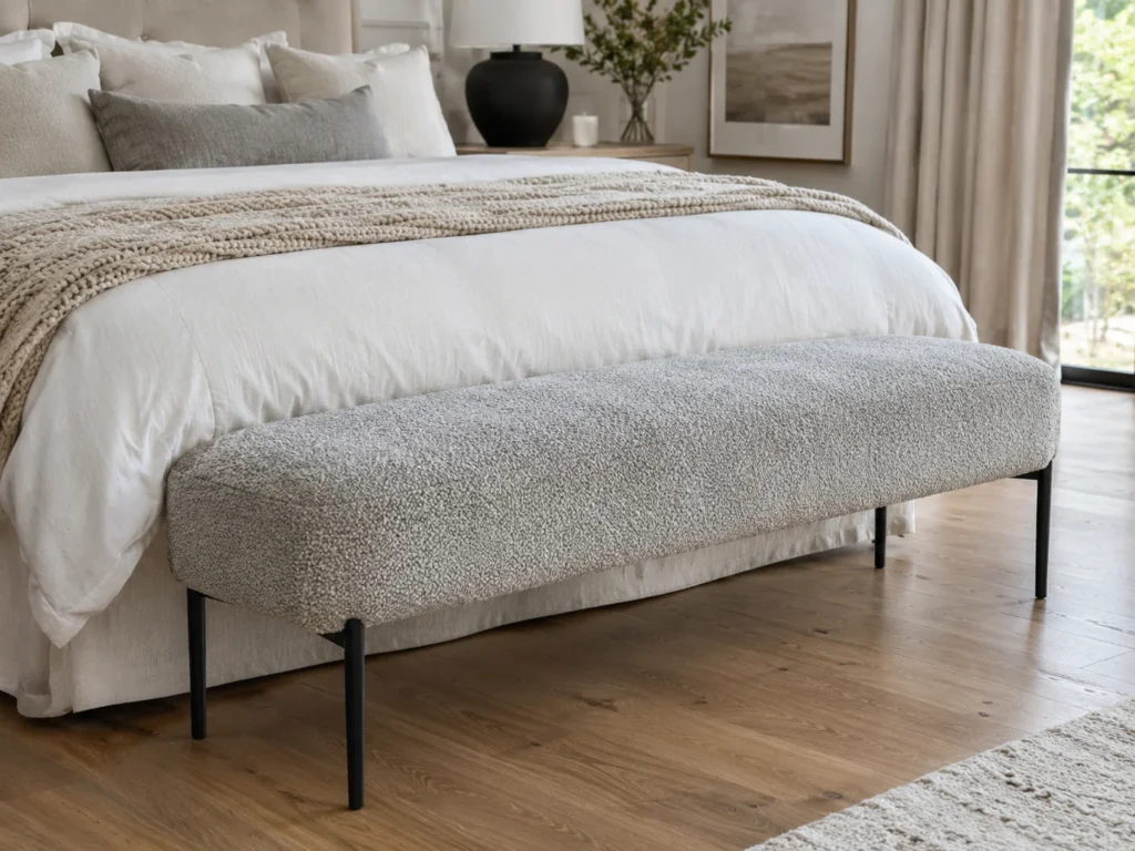
Bouclé is the single warmest texture you can introduce to a dark room. In a light heather grey it sits at rung four, and placed at the foot of a King it breaks up all that charcoal above with something pale and nubby at knee height.
The looped surface needs a hard counterpoint underneath. Black matte metal legs or a dark walnut frame does it, so the bench reads as deliberate rather than like a stray piece of upholstery. Soft on top, sharp below.
Pale bouclé marks and it marks easily. Denim transfers blue dye onto the seat edge, and the loops catch pet claws, which pulls threads permanently rather than just fraying them. Check whether the cover is removable before you commit, because most are not.
A thrifted wooden bench with a bouclé remnant stapled over a foam pad gets you the same thing for very little, and HomeGoods carries bouclé ottomans that work at the foot of a Queen.
Furniture and Natural Wood Warmth
Warm Walnut Nightstands Against Dark Slate
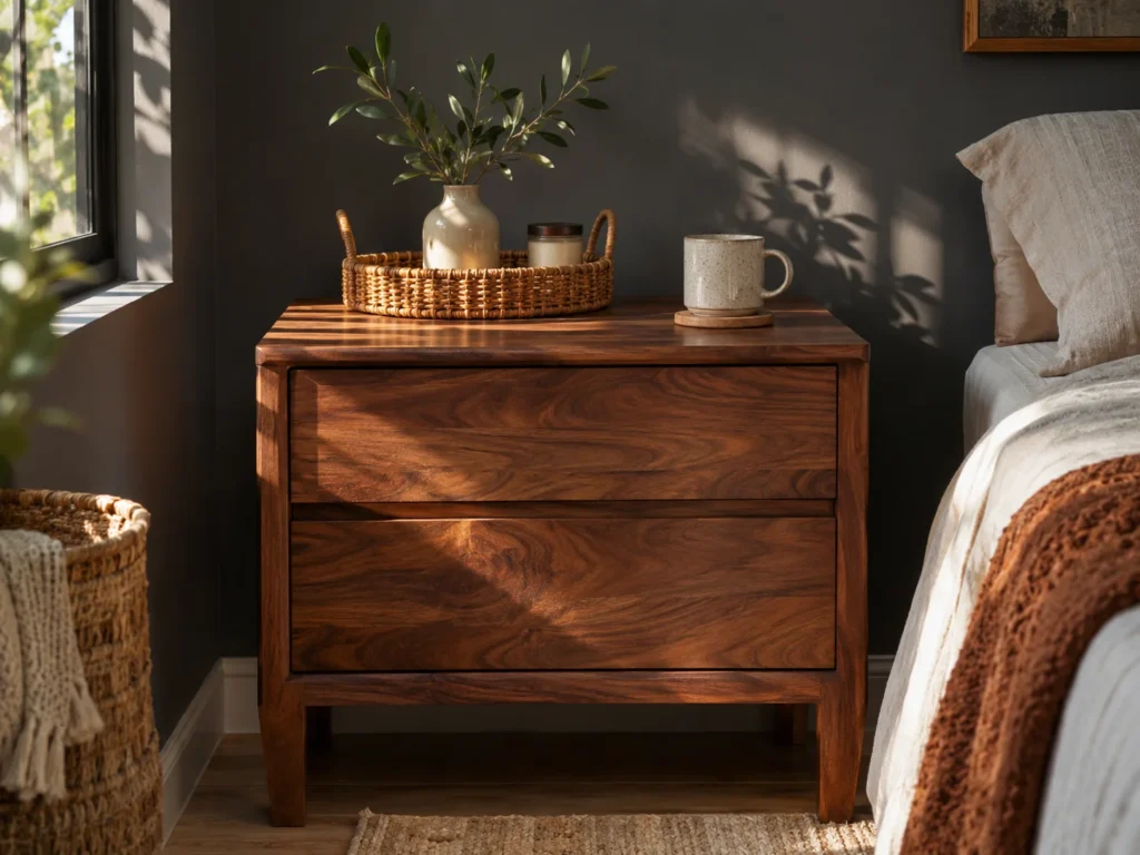
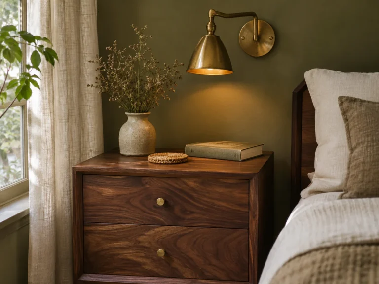
Walnut is the right wood for a black and grey room precisely because it is dark too. Its chocolate grain with reddish warmth sits against slate walls as a third dark tone rather than a bright interruption, which keeps the moodiness intact while removing the chill.
Put the smooth planed walnut top against something woven. A small rattan tray or a jute coaster on the surface gives you polished grain against rough fiber at exactly the height your eye lands when lying down.
Walnut is visually heavy, and two large walnut pieces in a dark room under 130 square feet will swallow it. One pair of nightstands plus lighter items elsewhere is the ratio. Watch the sealant too, since a yellow-toned polyurethane skews orange against cool slate.
A thrifted pine or oak nightstand flipped with a walnut gel stain is the classic budget version, and gel stain is far more forgiving than traditional stain on an already-finished piece. If most of your furniture already runs dark, these ways to style a bedroom around dark wood cover how to keep it from closing in.
A Natural White Oak Dresser Cutting the Cool Grey

Where walnut deepens, white oak lifts. Its pale honey grain is the brightest thing in an otherwise tonal room, and one oak dresser opposite the bed stops cool grey walls from reading as concrete. This is the piece that does the most warming per dollar.
Contrast the oak against matte iron. Black metal drawer pulls or a dark iron lamp sitting on top gives you warm open grain beside cold hard metal, which is the pairing that makes both look intentional.
Finish is everything with oak. Sealed with a yellow-toned polyurethane it goes distinctly orange next to grey, and the mismatch is obvious in daylight. Look for a matte hardwax oil or a clear water-based finish instead.
Seventies oak pieces turn up constantly on secondhand marketplaces for very little. Sand back the old finish, oil it, and you have better wood than most new furniture.
A Distressed Grey-and-Cream Vintage Rug Over Hardwood
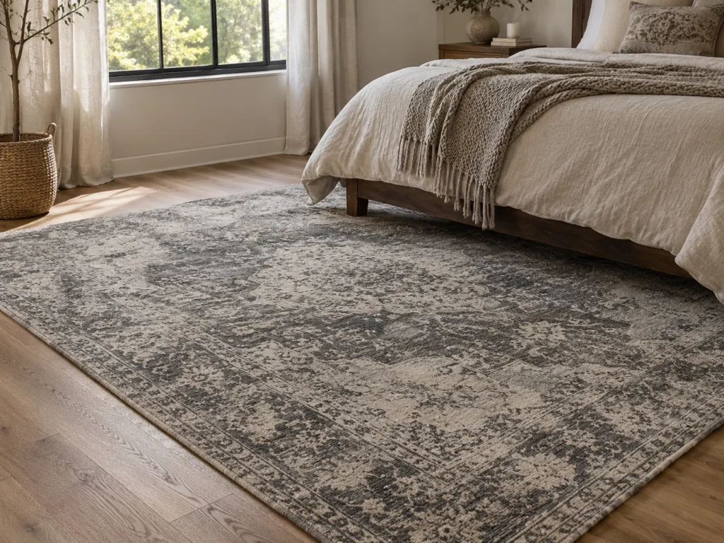
A faded vintage-style rug in greys and creams brings the one thing a tonal room struggles to manufacture, which is age. The worn patches and irregular dye give you several rungs of the ladder in a single piece, and the cream keeps it from disappearing into a dark floor.
Low-pile distressed wool against a chunky knit throw is the pairing here. Flat and faded underfoot, deep and raised on the bed, so the two softest things in the room do not match each other.
Size is where this goes wrong more than anything. Under a Queen you want at least an 8 by 10 so the rug extends about two feet past each side, and a 9 by 12 under a King. A 5 by 7 floating at the foot of the bed looks like a bath mat in person and in photos.
Machine-washable flatweave versions cost a fraction of hand-knotted wool and suit a rental or a house with pets. A thick rug pad underneath makes a budget rug feel considerably more expensive underfoot.
Three Texture Pairings That Kill Flatness
Matte against reflective: chalky limewash beside antique mirror or glass.
Plush against hard: velvet or bouclé beside matte iron and planed wood.
Loose against tight: rumpled washed linen under a raised waffle grid.
Every surface in a dark room needs an opposite nearby. One texture repeated everywhere is what reads as flat.
Lighting and Metallic Accents
Antique Brass Swing-Arm Sconces Against Matte Black
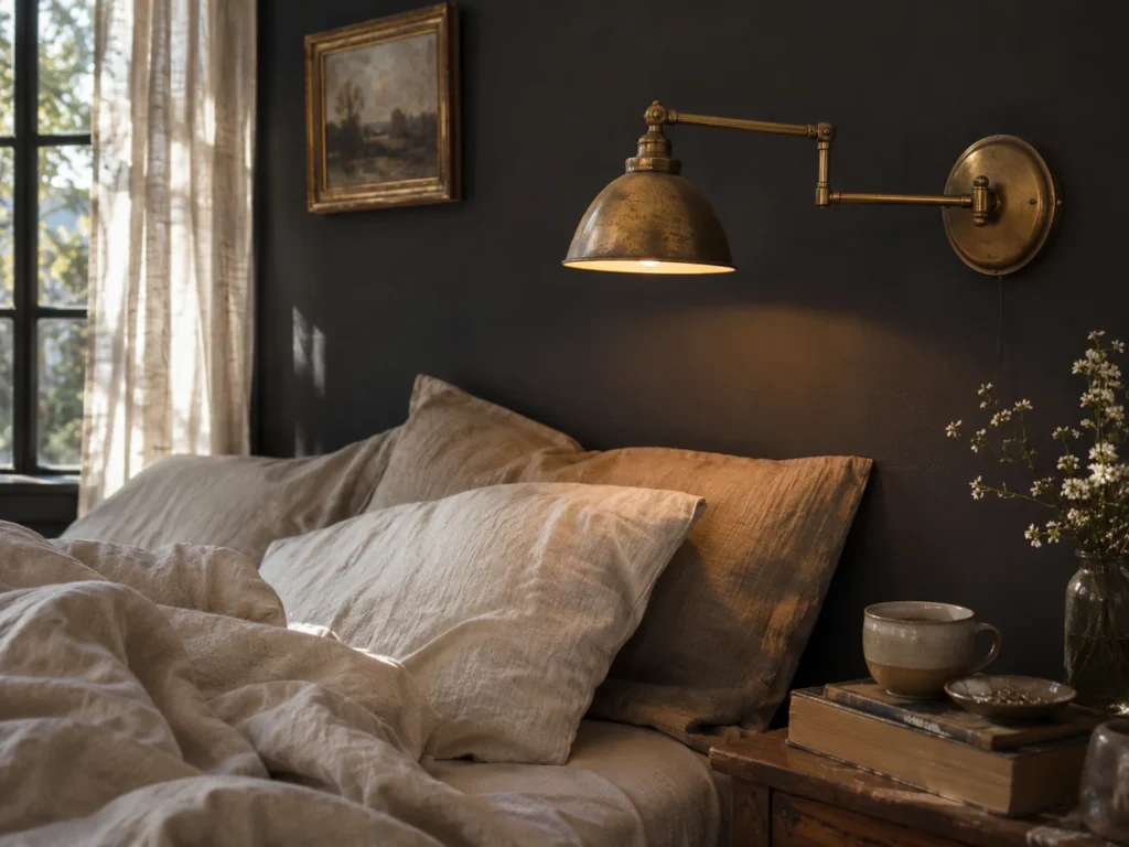
Brass is the warm metal that rescues a black and grey room from looking like a hardware showroom. Mounted against a matte black wall, aged brass reads almost gold, and the swing arm folds flat when you are not reading so it never crowds a small nightstand.
Unlacquered brass against matte paint is the pairing that works, because one surface reflects and the other absorbs completely. A polished chrome sconce in the same spot would bounce light harshly and flatten the wall behind it.
Unlacquered brass develops a patina, so the shine you bought will not stay, and that is worth deciding on before you order. Plug-in versions also leave a visible cord, so measure from the mounting point to the outlet before drilling anything.
Plug-in sconces skip the electrician entirely, and a paintable cord cover run straight down the wall and painted to match reads as intentional. Thrifted brass is usually better quality than new, and rewiring is a small job.
Bedroom Blueprint
Room Size: Any, and the best answer for rooms where nightstand space is tight.
Placement Map: Roughly 30 inches above the mattress, 6 inches out from each headboard edge.
Budget Tier: Mid.
Calm Score: 9 out of 10.
Amber 2200K Filament Lamps for a Golden Bedside Glow
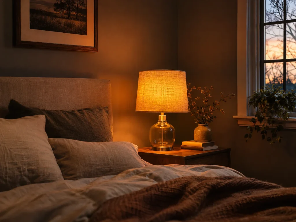
Dropping below 2700K is the trick most people never try. An amber filament bulb at 2200K throws a genuinely golden light, close to candlelight, and against charcoal walls that warmth is what turns moody into cozy. One lamp at this temperature does more than three at 3000K.
Put the warm glass against unbleached linen. A clear amber bulb under a natural linen shade gives you hard glowing glass behind soft diffused fabric, so you get the color without the filament glaring at you from the pillow.
At 2200K you cannot read comfortably for long, and color-matching clothes under it is hopeless. Treat it as atmosphere and keep a separate 2700K source for actual tasks. Exposed filaments also glare badly if you can see the bulb lying down, so check the sightline from the mattress.
An amber bulb in a lamp you already own costs very little and is the cheapest change on this entire list. For how to build the rest of the layers around it, these bedside lamp options for a warmer bedtime glow cover shade materials and placement.
Graphic Framing and Contrast
Black Metal Window Sashes Framing Soft Grey Drapery
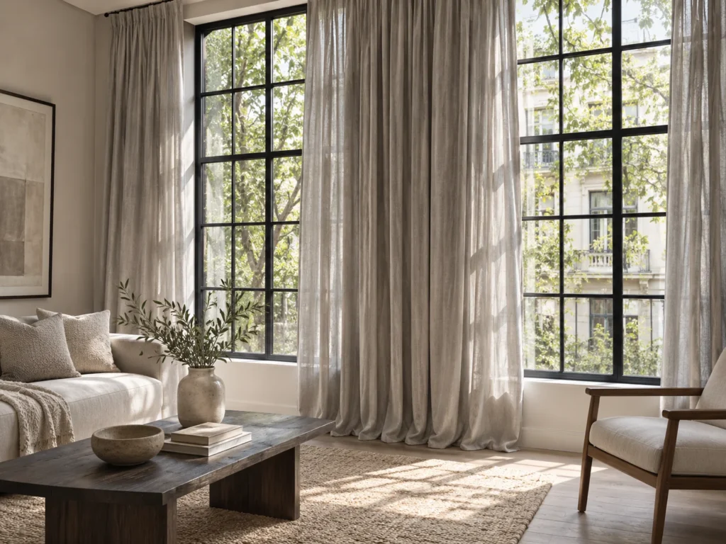
Black window frames against pale grey curtains give a tonal room its one hard graphic line. The dark sash turns the view into a framed picture, and the soft dove drapery either side keeps that frame from feeling industrial. Charcoal at the window, rung four at the fabric.
Hard painted metal beside loosely woven linen drapery is the pairing. Smooth and black against airy and pale, which is the same matte-versus-soft logic working at the brightest point in the room.
Vinyl windows are the catch, and it is a real one. Dark paint on vinyl absorbs heat and can warp the frame, and most manufacturers will void the warranty over it. Wood and fiberglass are fine. Check what you have before opening a can.
No-paint version: hang black curtain rods with black-framed roman shades underneath grey panels. You get the same graphic outline around the window with nothing permanent. Deeper, atmospheric palettes handle this well, as these darker boho bedroom schemes show.
Matching Grey Undertones to Wood, Light and Orientation
Most failed grey rooms are an undertone problem, not a shade problem. Find your orientation in the right-hand column and work backward.
| Grey Undertone | Coordinating Wood | Ideal Lighting | Room Orientation Caution |
|---|---|---|---|
| Warm taupe-grey Repose Gray type |
Walnut, cherry, honey oak | 2700K | The safest pick for north-facing rooms. Can go slightly yellow in strong south light. |
| Neutral heather | White oak, ash | 2700K | Reliable in east and west rooms. Needs lamps by late afternoon. |
| Cool slate | Teak, warm mango wood | 2700K only, never higher | Avoid north-facing rooms entirely. Goes blue and cold by mid-morning. |
| Soft dove with blue base | White oak, birch | 2700K | Turns lilac in cool north light. The most common grey failure of all. |
| Smoky pewter Peppercorn type |
Walnut, smoked oak | 2700K, dimmable | Flattens in east rooms after midday. Plan on lamps from early afternoon. |
| Deep matte charcoal Iron Ore or Kendall type |
Honey oak, rattan, brass accents | 2700K plus one 2200K accent | Swallows daylight in small north rooms. Use on one surface, not four. |
Common Styling Mistakes to Avoid
Running 4000K or 5000K daylight LEDs in a dark room. Cool white strips every bit of warmth out of charcoal and turns the whole space into an office after dark. Every bulb should read 2700K on the box, including the closet and any smart bulbs sitting on a daylight preset.
Skipping wood and leather entirely. Black plus grey plus nothing organic is exactly the flat bachelor-pad look people are trying to avoid. One walnut or oak piece, or a worn leather bench, adds the third tone that makes the greys read as deliberate.
Painting deep charcoal in a north-facing bedroom with one light source. North light is already cool and sparse, and charcoal absorbs most of what comes in. If you want the dark walls anyway, budget for three warm lamp sources at different heights before you buy the paint.
Using one grey everywhere. Matching your walls, bedding, curtains and rug to the same swatch is what produces the flat grey blur. Spread them across at least three rungs of the ladder, and vary the weave at every step.
Frequently Asked Questions
How do I keep a black and grey bedroom from feeling like a basement?
Vary the tone instead of matching it, so run charcoal, slate, heather and dove rather than one grey everywhere. Add warm wood and at least two contrasting textures per surface. Then light it at 2700K with three sources at different heights rather than one ceiling fixture.
What are the best paint colors for a black and grey bedroom?
Sherwin-Williams Iron Ore and Benjamin Moore Kendall Charcoal are the two most commonly used dark anchors, both warm enough to avoid going cold. Sherwin-Williams Peppercorn works for a smoky mid-tone and Repose Gray for the lighter rung. Choose eggshell over flat so you can wipe scuffs off.
Can I do black and grey in a small bedroom?
Yes, as long as the dark tone lives on one surface rather than all four walls. Put charcoal behind the bed, keep the remaining walls at a warm dove, and move the deeper greys onto textiles. Under 120 square feet, skip the dark ceiling entirely.
Which wood goes best with grey walls?
Walnut if you want to keep the room moody, since it reads as a third dark tone with warmth built in. White oak if the grey is feeling cold and you need to lift it. Avoid anything sealed with a yellow-toned polyurethane, which turns orange next to grey.
Final Thoughts
Buy sample pots before gallons, paint large squares on white card, and look at them at 9am, 3pm and again under your lamps at night. Grey shifts more between those three moments than any other color, and a swatch that looks right in the store is the least reliable version of it.
Then build depth with texture rather than more color. Add one contrasting surface at a time, a waffle blanket over linen, a rattan tray on planed walnut, and the room gains dimension without going darker. That layering is what separates a moody bedroom from a flat one.