Olive Green Bedroom Ideas That Stay Earthy, Not Swampy
Olive turns murky for one reason, and it is the undertone sitting underneath the green. Grey-heavy olives collapse into brown the moment the light drops, which is how you end up with a swamp instead of a warm earthy room.
Pick a mid-tone olive with a clear yellow undertone instead, something like Sherwin-Williams Dried Thyme or Benjamin Moore Spanish Olive. Swatch it on two opposite walls, since olive shifts hard between sunlit and shaded, and check both under 2700K lamplight at night.
Pair it with a creamy off-white like Alabaster rather than a stark clinical white, which would drain the warmth straight out. Then add walnut or honey oak, since wood is what tips olive from swampy toward genuinely earthy.
Architectural and Wall Treatments
Golden-Olive Board and Batten Behind the Headboard
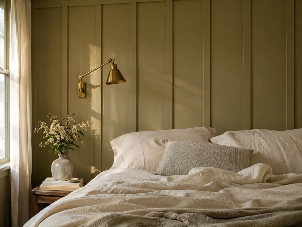
A golden khaki olive, warm enough that it almost reads tan in direct sun, is the safest entry point for this color. Battens give the wall vertical relief, and that matters more with olive than with a neutral, because the shifting shadow between strips keeps the green reading as several tones rather than one flat field of sludge.
Set the matte painted wood against something with a sheen. Washed linen bedding in cream in front of it, or a single unlacquered brass sconce mounted on the batten itself, gives you chalky against gleaming.
Painted trim shows dust along every horizontal batten edge, and on a mid-tone olive that dust reads as a pale grey line rather than disappearing. Satin on the battens wipes down where matte will not, and you will be running a cloth along them more often than you expect.
Peel-and-stick vertical slat panels painted olive cost a fraction of lumber and trim, and they come away from drywall with a heat gun at the end of a lease.
Bedroom Blueprint
Room Size: Works at 8 foot ceilings. Headboard wall only under 130 square feet.
Placement Map: Battens 16 inches on center, floor to ceiling behind a Queen or King.
Budget Tier: Mid.
Calm Score: 9 out of 10.
Drenching the Whole Room, Baseboards and Door Casing Included

Taking one olive across walls, baseboards, casing and the back of the door removes every place two colors used to meet. With a color this complex, that continuity is what stops the room feeling like a green box with white edges. Use a muted sage-olive rather than a deep one, closer to Sherwin-Williams Peale Green, so four walls of it stays breathable.
Drenching needs texture or it suffocates. A chunky bouclé cushion over a woven jute rug gives you looped and nubby against coarse and flat, both in the same tonal family as the walls.
Trim absorbs paint differently from drywall, so the identical color in the identical sheen can still look slightly mismatched between the two surfaces. Prime bare trim first. Use eggshell on walls and satin on trim, which holds up to scuffs without an obvious sheen jump.
Two gallons covers a 10 by 12 room including trim, which makes this one of the cheapest ideas here per square foot of impact. There is more on committing a single tone across a whole room in these moody tonal schemes that avoid going flat.
A Half-Painted Wall With Creamy Drywall Above
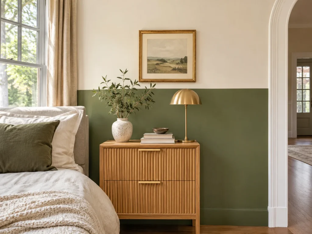
Running olive across the lower portion with a creamy off-white above gives you the color without the weight, and it is the right call in a room with a single window. Keep the olive earthy and mid-depth, and put Alabaster or a similar warm cream on top. The cream does the reflecting, the olive does the grounding.
Smooth flat paint beside a ribbed oak nightstand is the contrast at the dividing line. Hard fluted grain against soft matte wall, right where the two colors meet.
Split height is what makes or breaks this. Halfway up reads as a waiting room every time. Run the olive to about two thirds of the wall, or line the break up with the top of your headboard so it looks intentional rather than arbitrary.
A simple wood chair rail painted the same olive hides a wobbly cut line and costs very little at any home center. Renters can skip paint entirely and use a wide olive peel-and-stick band instead. Choosing the warm cream for the upper portion follows the same logic as these warm neutral schemes that avoid feeling cold.
Olive Limewash for a European Cottage Depth
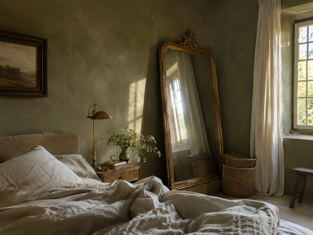
Limewash is the one treatment that fixes olive’s flatness problem at the source. The cloudy mineral movement breaks the green into lighter and darker passages across the same wall, so it never settles into one muddy plane. An earthy drab olive, slightly dusty, is the tone that reads most like old plaster.
The chalky surface wants something polished nearby. Unlacquered brass on the nightstand or an antique mirror leaning in the corner gives you powdery against reflective.
Here is the catch specific to limewash behind a bed. The finish is genuinely chalky, and it rubs off onto pillows and headboards that touch it. Either seal the lower portion with a matte limewash topcoat, or pull the bed an inch off the wall. Scuffs also never blend invisibly on touch-up.
A warm olive matte emulsion with a dry-brushed second coat in a lighter tone, applied in loose circles, gets you close for a third of the cost per gallon.
The Olive Swatch Test
Paint two large samples on white card, not on the wall itself.
Tape one to a sunlit wall and one to the shaded wall opposite. Olive diverges more between those two than almost any other color.
Check both at 9am, 3pm and again under your lamps at 9pm.
The failure signal: if either sample reads brown or grey at any of those three checks, the undertone is too grey. Put it back and find one with more yellow.
Bedding and Soft Textiles
Washed Olive Flax Linen Under a Rust Waffle Throw

Rust is olive’s best partner because the two sit close to opposite each other on the color wheel while sharing the same earthy warmth. A washed olive linen duvet with a rust waffle throw across the lower third of a Queen gives you contrast that never reads as a clash. The linen’s slubby weave also scatters light so the olive shifts across the bed instead of sitting flat.
Loose rumpled linen under a tight raised waffle grid is the texture pairing doing the work. Two different structures, two different colors, one bed.
Olive linen fades unevenly with heat, and it fades toward grey rather than simply going paler, which undoes the warm undertone you paid for. Wash cold, line dry when you can, and skip fabric softener since it coats the fibers and dulls the finish.
A cotton-linen blend costs a fraction of pure flax and rumples nearly as well after two washes. Target and HomeGoods both carry rust waffle throws seasonally for very little.
A Channel-Tufted Olive Velvet Headboard Against Ivory
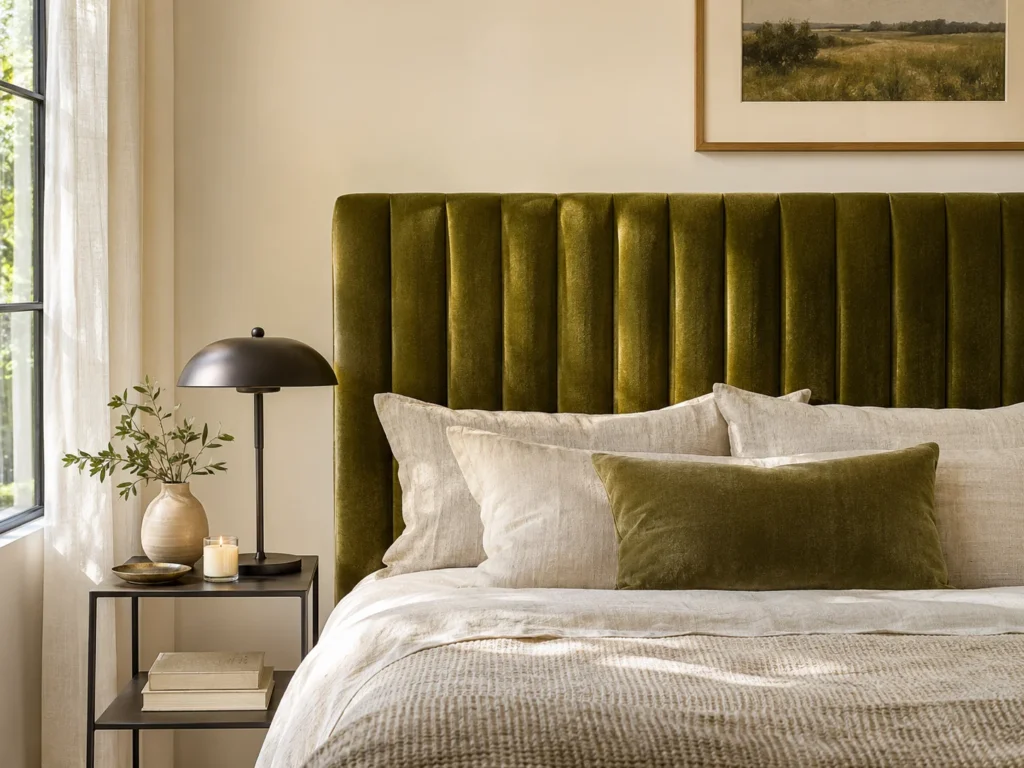
Velvet is the fabric that proves olive is not muddy, because the pile throws back a faint gold sheen along every ridge where flat fabric would absorb it. Channel tufting runs in long vertical columns, so the headboard reads as a series of lit and shadowed stripes rather than one heavy slab. Set it against creamy ivory walls so the green has somewhere bright to land.
Plush velvet beside matte black iron nightstands is the opposition that keeps it from going soft and shapeless. Deep pile against hard metal.
Velvet holds dust in every channel groove, and on a mid-tone olive that dust shows as pale lines down the headboard. A soft brush attachment every couple of weeks handles it. If you have a shedding pet, crushed velvet hides hair considerably better than a smooth pile.
An olive velvet slipcover over a frame you already own is the cheap route. Alternatively, staple velvet over a plywood panel and hang it on a French cleat for well under the cost of a new bed.
Bedroom Blueprint
Room Size: Medium to large. A tall tufted headboard crowds anything under 120 square feet.
Placement Map: Centered on the longest wall, top edge around 48 inches from the floor.
Budget Tier: Mid to high.
Calm Score: 9 out of 10.
A Tone-on-Tone Gradient From Pale Sage to Deep Olive
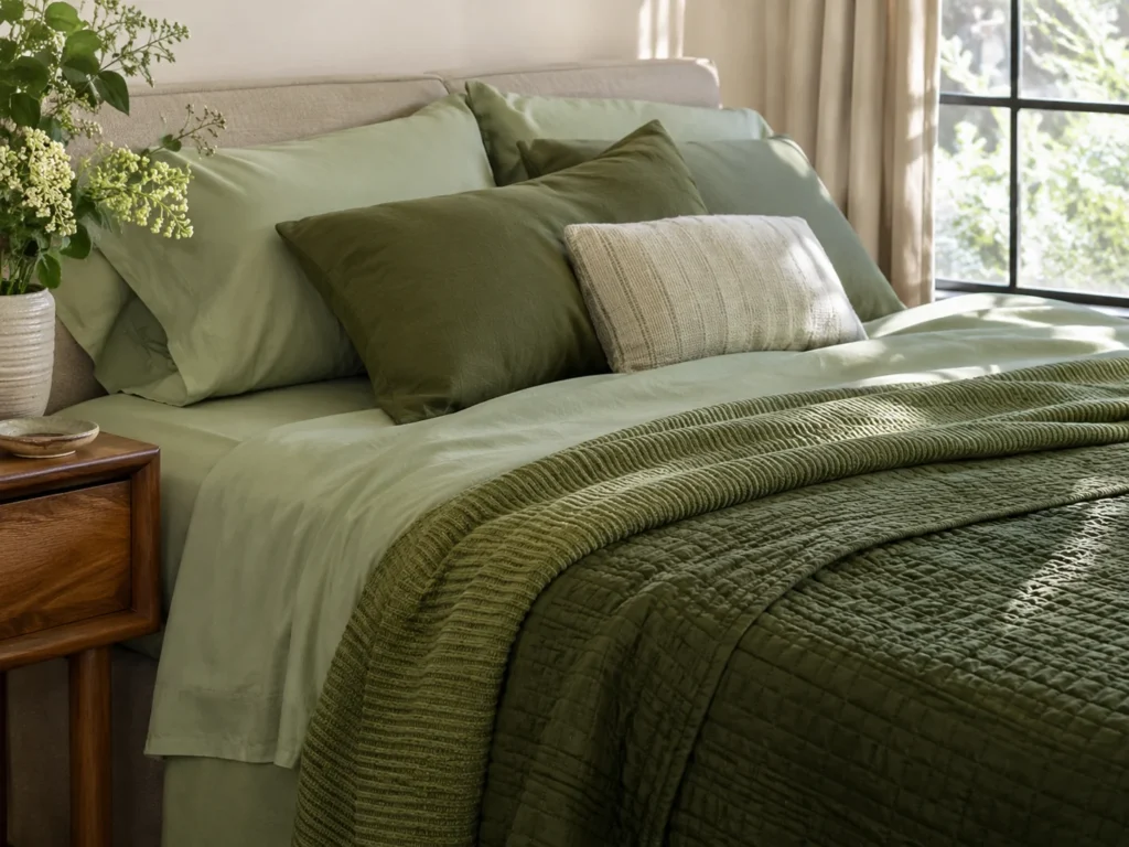
Layering pale sage sheets under a deep olive quilt builds the color in steps rather than dropping it all at one depth. That gradient is what reads as considered instead of monotone, and it works because sage and olive share the same yellow-green base at different saturations. Pale sheets at the top, mid olive in the middle, deepest at the foot.
Change the weave at every step or the gradient looks like paint chips stacked on a bed. Smooth percale sheets, a ribbed cotton blanket, then a quilted cotton coverlet. Each depth gets its own surface.
Pale sage sheets pick up hair oil and makeup faster than any other part of this setup, and sage shows it clearly where a deep olive would hide it. Choose removable washable covers rather than sewn-shut decorative pieces, and keep the palest layer where heads do not rest.
Build the gradient from pillow covers and a single quilt rather than buying full sets at three depths. It costs a fraction and lets you shift the balance by season.
Heavy Olive Drapes Framing White Sheer Panels
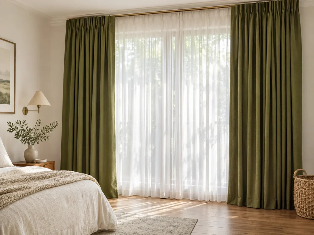
Deep forest moss curtains on the outside with white sheers behind them is the layering that makes olive feel generous rather than heavy. The sheer keeps daylight coming through while the moss panels frame the window like a theater opening. Mount within 2 inches of the ceiling and extend 8 to 10 inches past the trim on each side.
Heavy lined cotton against gauzy white voile is the pairing, and the gap in weight between them is the whole point. Dense and opaque beside airy and translucent.
Dark green fabric fades in direct sun, and it fades in visible vertical bands on the leading edge that catches the most light. Rotate the panels end to end once or twice a year. Double rods also need real depth clearance, so measure before ordering if your window sits close to a corner.
A single olive panel pair over an existing white sheer gets you most of the effect, and a ceiling-mounted tension track handles it where drilling is not allowed.
Furniture, Lighting and Contrast Accents
Walnut Nightstands With Unlacquered Brass Sconces
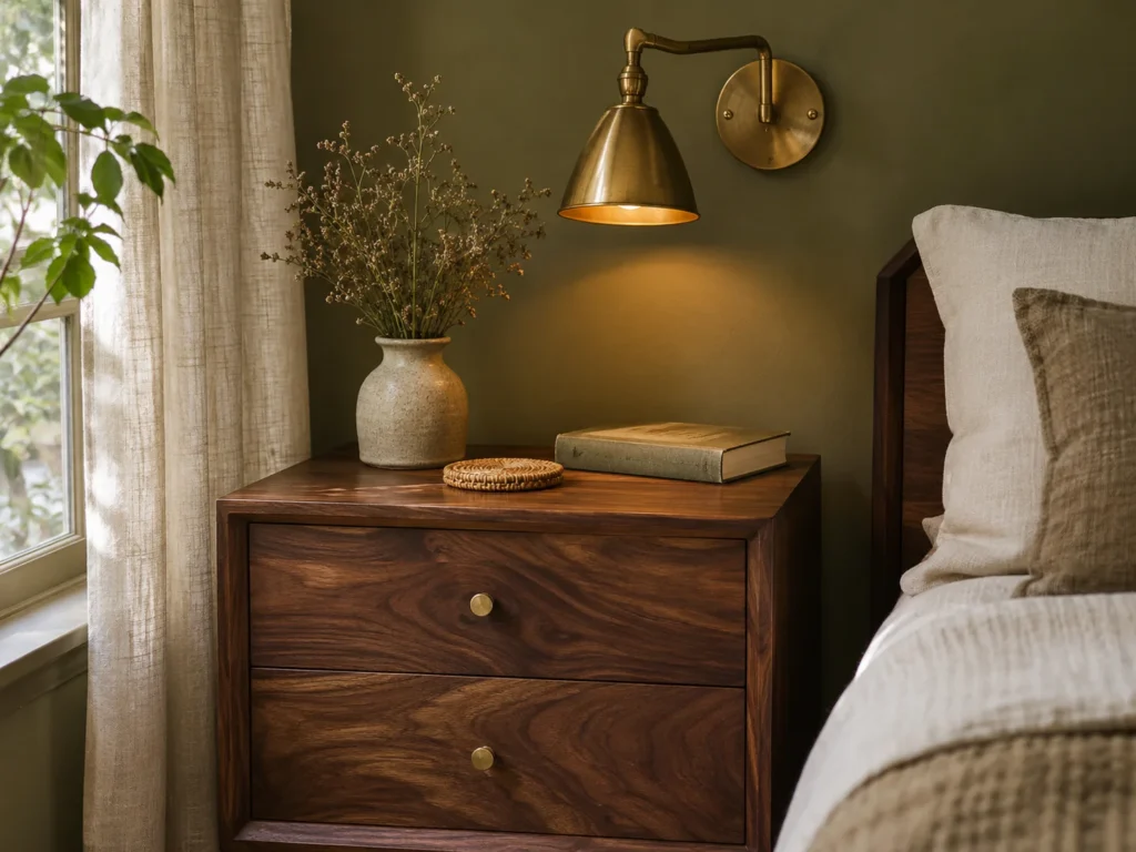
Walnut and brass are the two materials that settle the murky question for good. Walnut brings reddish warmth that directly counters any grey hiding in the green, and aged brass adds a gold note that pulls the yellow undertone forward. Against a mid-tone olive wall, the combination reads deliberately earthy.
Put the planed walnut top against a woven tray. Polished grain beside rough rattan or jute, right at the height your eye lands lying down.
Unlacquered brass develops a patina, so the shine you bought will not stay, and that is a decision to make before ordering rather than a surprise later. Watch the walnut sealant too, since a yellow-toned polyurethane goes orange against olive and the mismatch is obvious in daylight.
A thrifted pine nightstand flipped with a walnut gel stain is the standard budget route, and gel stain is far more forgiving over an existing finish than traditional stain. If your furniture is already running dark, these ways to style a bedroom around dark wood cover keeping the room from closing in.
A Pale White Oak Dresser Cutting Through Deep Moss Walls
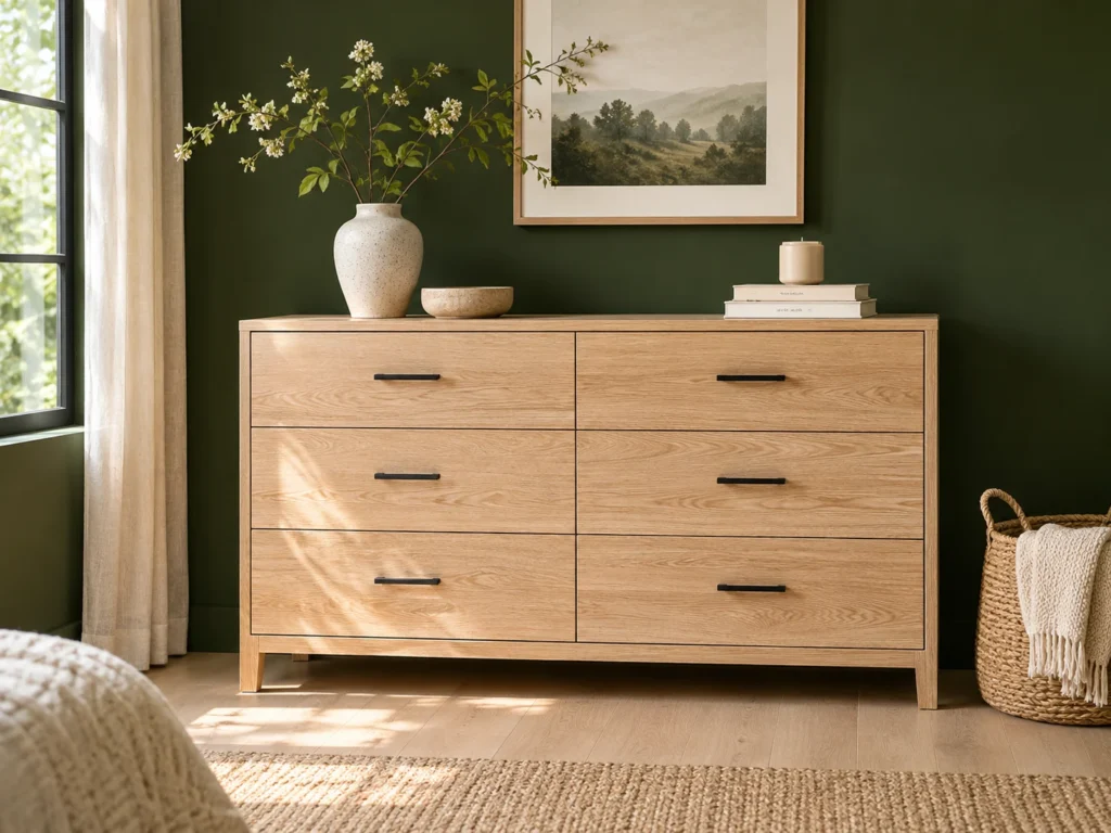
Where walnut deepens, white oak lifts. Against a deep forest olive wall, a pale honey oak dresser is the brightest natural thing in the room and it stops the green from swallowing everything. This is the single piece that does the most work per dollar in a dark olive bedroom.
Open oak grain beside matte black drawer pulls is the contrast. Warm and porous against cold and hard, which makes both look chosen rather than inherited.
Finish is everything here. Oak sealed with a yellow-toned polyurethane skews almost neon against olive, since both have yellow in them and the two fight. Look for a matte hardwax oil or a clear water-based finish that keeps the grain honest.
Seventies oak pieces turn up constantly on secondhand marketplaces for very little. Sand off the old orange finish, oil it, and you have better wood than most new furniture. A deep moss wall also eats daylight, so plan on three warm sources at different heights, and these bedside lamp options for a warmer glow cover shade materials that suit a dark room.
Why Olive Needs Wood More Than Grey Does
Olive already contains yellow, so it harmonizes with wood instead of merely contrasting against it.
That harmony is the point. Grey needs wood for warmth, olive needs it for credibility as an earthy color rather than a murky one.
Walnut counters any grey in the green. White oak lifts a deep olive. Rattan and cane add gold.
The one wood to avoid: anything with an orange-toned factory polyurethane, which fights olive’s yellow and reads as clashing rather than layered.
A Woven Cane Headboard Against Muted Moss
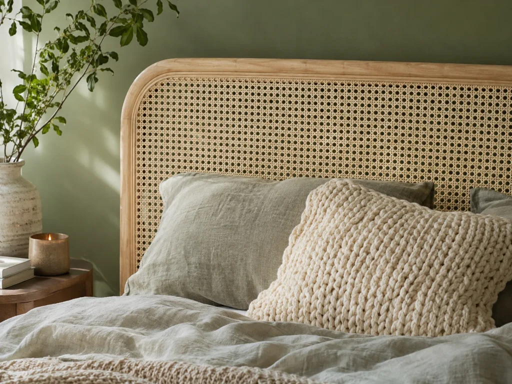
Bleached cane webbing is the lightest, most golden thing you can put against a muted moss wall. The open weave lets the wall color show through in dozens of small diamonds, so headboard and wall read as one layered surface rather than an object sitting in front of paint.
Open cane against smooth matte paint is the pairing, airy and perforated against solid and flat. Add a chunky knit pillow in front and you have a third texture without a third color.
Cane dries out and cracks near a forced-air vent or a radiator, which is a genuine issue in American homes with central heating. It also traps dust in every opening, so a vacuum brush attachment once a month is part of the deal.
Renters can lean a cane room divider panel against the wall behind the bed with no mounting at all. Thrifted cane chairs and headboards turn up regularly and a light sand plus clear wax revives tired webbing.
A Gallery Wall of Vintage Botanical Prints in Thrifted Frames
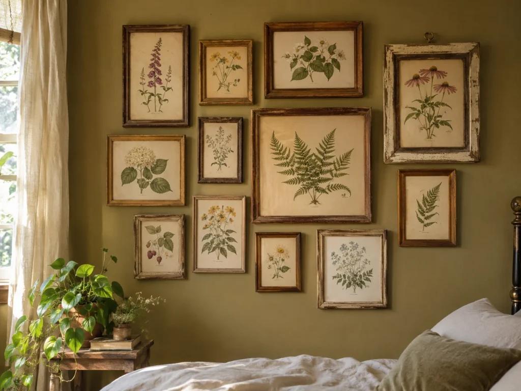
Botanical prints work with olive in a way they never quite do with grey, because the color on the wall and the subject in the frame come from the same place. Antique plant illustrations on aged cream paper against a golden khaki wall keep the whole room feeling collected rather than decorated. Six to nine frames in mixed timber tones reads better than a matched set.
Varied timber frames against smooth painted wall is the contrast, and the frames should not match each other. Mixed grain and mixed age beside one uniform color field.
Glass bounces window glare straight back, and a gallery wall opposite a window becomes a row of reflections rather than pictures. Hang it on the wall perpendicular to the light, or use non-glare glass. Mixed frames also need tight consistent spacing, around 2 to 3 inches, or the arrangement looks accidental.
Public domain botanical illustrations print cheaply at any local print shop, and thrift stores sell timber frames for a dollar or two. This is the lowest-cost idea on the list by a wide margin. Moodier, more atmospheric versions of this look sit well with olive too, as these darker boho bedroom schemes show.
Matching Olive Undertones to Wood, Light and Orientation
Olive fails on undertone, not on shade. Find your room’s orientation in the last column and work backward from there.
| Olive Undertone | Coordinating Wood | Ideal Lighting | Room Orientation Pitfall |
|---|---|---|---|
| Warm golden-olive Dried Thyme type |
Honey oak, white oak, cane | 2700K | The safest pick for north-facing rooms. Can read almost tan in strong south light. |
| Muted sage-olive Peale Green type |
White oak, ash, rattan | 2700K | Reliable in east and west rooms. Goes slightly flat after midday without lamps. |
| Grey-olive | Walnut only, to counter the grey | 2700K, never higher | The murky culprit. Avoid north-facing rooms entirely, where it turns brown by late afternoon. |
| Earthy drab olive | Walnut, teak, aged brass accents | 2700K plus one 2200K accent | Needs south or west light to stay lively. Add three warm lamps anywhere else. |
| Deep forest moss Dark Olive type |
Pale white oak, birch, rattan | 2700K, dimmable | Swallows daylight in small north rooms. Use on one wall, not four. |
| Rosemary mid-olive | Walnut, cherry, honey oak | 2700K | Versatile across orientations. Watch it against cool-white ceilings, where it greys off. |
Common Styling Mistakes to Avoid
Matching every surface to the same olive. Olive walls plus olive bedding plus olive curtains at one identical depth is exactly how a room reads as swampy. Spread the color across at least three depths, from pale sage through mid olive to deep moss, and vary the weave at every step.
Running 4000K or 5000K cool white bulbs. Cool light strips the yellow out of olive and leaves the grey behind, which turns a warm earthy wall distinctly military by evening. Every bulb should read 2700K on the box, closet and smart bulbs included.
Pairing olive with a stark blue-based white ceiling. Cool white above olive creates a hard clinical line at the top of the room and drains the warmth out of the green below it. A creamy off-white like Alabaster or Swiss Coffee overhead fixes it for the price of one gallon.
Skipping warm wood entirely. Olive without wood has nothing anchoring it to the natural world, and that is when it stops reading as earthy and starts reading as a paint choice. One walnut or oak piece is the minimum.
Frequently Asked Questions
Is olive green warm or cool?
Olive is technically a warm green, since it sits on the yellow side of the green family rather than the blue side. The complication is that many paint olives carry a heavy grey base that behaves like a cool color in low light. Check for visible yellow in the swatch and you will stay on the warm side.
Does olive green make a bedroom feel small?
A deep forest moss on all four walls will close in a small room, but a mid-tone golden olive usually adds depth rather than shrinking it. Under 120 square feet, put the olive on one wall and keep the rest a creamy off-white. A half-painted wall is the other reliable option.
What colors go best with olive green bedding?
Rust and terracotta are the strongest partners, since they sit near opposite olive on the wheel while sharing its earthiness. Creamy off-whites, warm camel and soft mustard all work alongside it. Avoid stark white and cool grey, which both pull olive toward murky.
Why does my olive green paint look brown?
The undertone is too grey and your room most likely faces north, where cool sparse light drains the yellow and leaves the brown behind. Switching to an olive with visible yellow in the swatch fixes it. Warm 2700K bulbs will also correct a good deal of it after dark.
Final Thoughts
Buy two or three sample pots before a single gallon, and paint big squares on white card rather than straight onto the wall. Tape one to a sunny wall and one to the shaded wall opposite, then look at both in the morning, the afternoon and again under lamplight. Olive shifts further between those three moments than any other color on a paint deck.
Once you have the undertone right, the rest is layering. Add one wood piece, one brass or rattan accent, and one rust textile, and the green will settle into something that feels grounded rather than gloomy. Work in that order and you will not end up repainting.